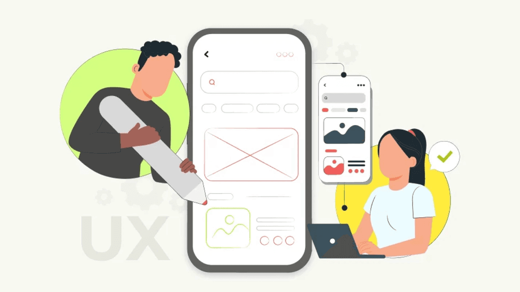
🎯 5 UI/UX Mistakes Beginners Make (And How to Avoid Them)
Jan 23, 2025

🔍 Skipping User Research
The Mistake:
Jumping straight into design without understanding the user’s goals, pain points, or environment.
Why It's a Problem:
You risk designing something that looks good but doesn’t solve the right problem. That’s decoration, not design.
How to Avoid It:
Start with user interviews, surveys, or observational research.
Create personas or journey maps to understand real behavior.
Use insights to define user needs and features—not guesses.
🛠️ Confusing UI with UX
The Mistake:
Focusing entirely on visual aesthetics (buttons, fonts, shadows) and ignoring usability, flow, or accessibility.
Why It's a Problem:
A beautiful interface that’s hard to use is like a sports car with no steering wheel.
How to Avoid It:
Ask: Can the user complete their task without confusion?
Focus on information architecture, user flows, and intuitive navigation first.
Prioritize clarity over creativity.
Remember: UI is what it looks like. UX is what it feels like.
3. Not Designing With Real Content
The Mistake:
Relying on lorem ipsum, placeholder images, or generic CTAs during wireframes and mockups.
Why It's a Problem:
It creates misleading layouts that break once real content is added, ruining the UX.
How to Avoid It:
Use real or near-real content as early as possible.
Create content-first wireframes with actual headlines, buttons, error states, etc.
Collaborate with content writers or bring your own placeholder copy.
5. Designing Without Considering Responsiveness
The Mistake:
Designing for desktop only—or treating mobile like an afterthought.
Why It's a Problem:
A huge chunk of users may access your product from smaller screens. If it breaks or feels clunky, they’re gone.
How to Avoid It:
Start with mobile-first design. It's often more challenging, but more user-centric.
Use flexible grids, scalable fonts, and test on different screen sizes.
Use Figma constraints or auto-layout features for smoother responsiveness.
Final Thoughts
Making mistakes is part of the journey—but recognizing them early can fast-track your growth as a UI/UX designer. Whether you’re transitioning from another field or just starting out, focus on empathy, testing, and problem-solving over perfection.
Keep designing. Keep asking why. And never forget: Good design is invisible, but bad UX is unforgettable.
1. Skipping User Research
The Mistake:
Jumping straight into design without understanding the user’s goals, pain points, or environment.
Why It's a Problem:
You risk designing something that looks good but doesn’t solve the right problem. That’s decoration, not design.
How to Avoid It:
Start with user interviews, surveys, or observational research.
Create personas or journey maps to understand real behavior.
Use insights to define user needs and features—not guesses.
2. Confusing UI with UX
The Mistake:
Focusing entirely on visual aesthetics (buttons, fonts, shadows) and ignoring usability, flow, or accessibility.
Why It's a Problem:
A beautiful interface that’s hard to use is like a sports car with no steering wheel.
How to Avoid It:
Ask: Can the user complete their task without confusion?
Focus on information architecture, user flows, and intuitive navigation first.
Prioritize clarity over creativity.
Remember: UI is what it looks like. UX is what it feels like.
3. Not Designing With Real Content
The Mistake:
Relying on lorem ipsum, placeholder images, or generic CTAs during wireframes and mockups.
Why It's a Problem:
It creates misleading layouts that break once real content is added, ruining the UX.
How to Avoid It:
Use real or near-real content as early as possible.
Create content-first wireframes with actual headlines, buttons, error states, etc.
Collaborate with content writers or bring your own placeholder copy.
5. Designing Without Considering Responsiveness
The Mistake:
Designing for desktop only—or treating mobile like an afterthought.
Why It's a Problem:
A huge chunk of users may access your product from smaller screens. If it breaks or feels clunky, they’re gone.
How to Avoid It:
Start with mobile-first design. It's often more challenging, but more user-centric.
Use flexible grids, scalable fonts, and test on different screen sizes.
Use Figma constraints or auto-layout features for smoother responsiveness.