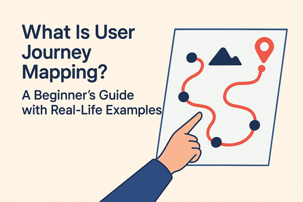
🧭 What Is User Journey Mapping? A Beginner’s Guide with Real-Life Examples
Jan 16, 2025
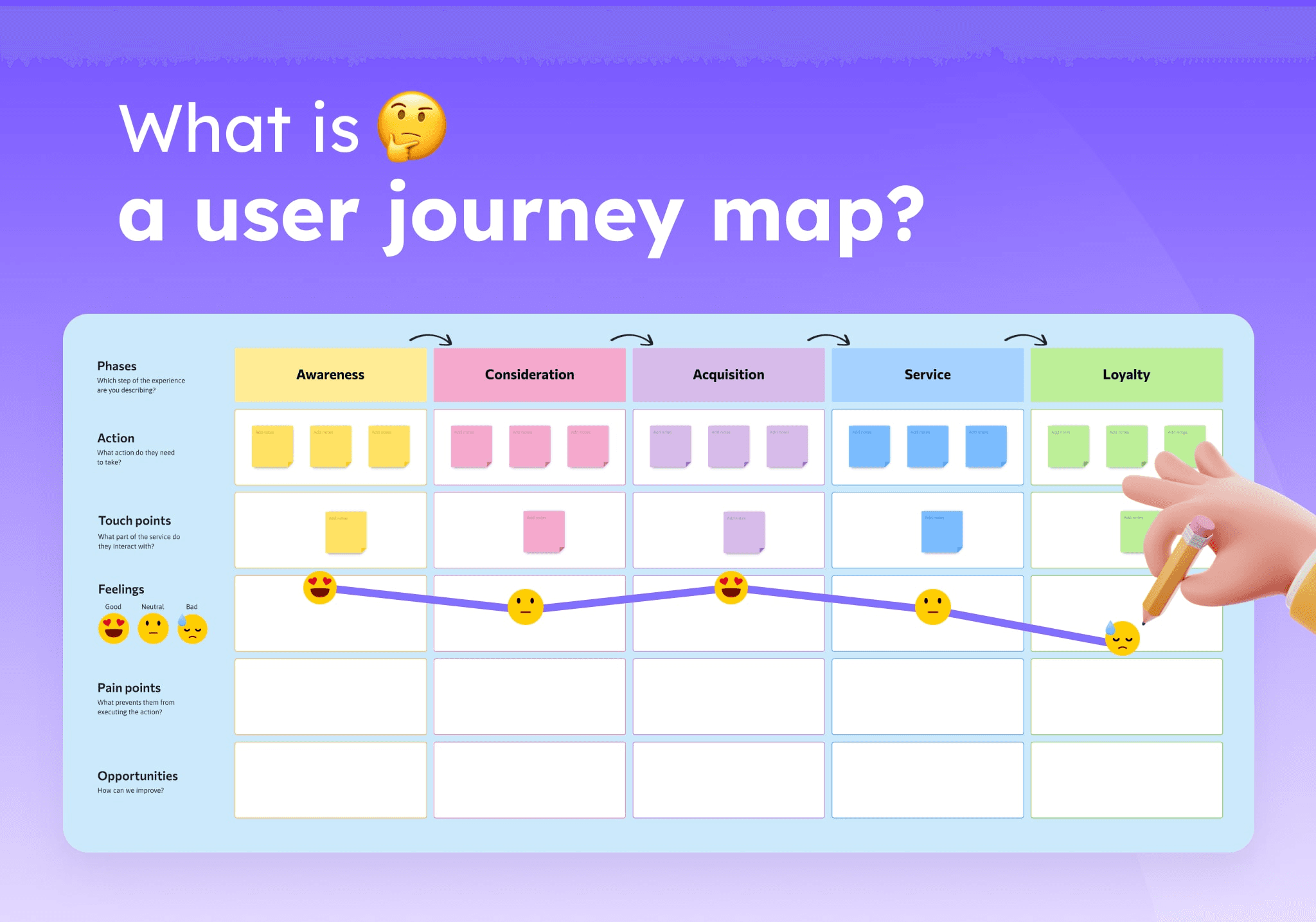
🔍 What Is a User Journey Map?
A user journey map is a visual storyline of how a user interacts with your product or service over time. It includes:
Stages of interaction (awareness, signup, usage, etc.)
User actions
Thoughts and emotions
Pain points
Opportunities for improvement
The goal? Understand the user experience end-to-end — not just screen by screen.
🧠 Why Use a User Journey Map?
BenefitImpactEmpathyHelps teams design for real needs, not assumptionsClarityAligns product, design, and dev on user experienceProblem-SolvingPinpoints friction in the journeyInnovationReveals new feature ideas or UX enhancements
🧱 Core Elements of a Journey Map
Persona
The specific user you’re mapping for (e.g., “Riya, a 27-year-old working mom using a grocery app”).Scenario & Goals
What the user wants to do (e.g., “Order weekly groceries in under 10 minutes”).Stages
Steps the user takes (e.g., Browsing → Adding to cart → Checkout → Delivery tracking).User Actions
What they do at each stage (tap, scroll, search, exit, etc.)Emotions
How they feel (frustrated, confused, delighted, relieved).Pain Points
Obstacles, friction, or drop-off moments.Opportunities
Ideas to improve the UX or address frustrations.
📊 Example: Journey Mapping for a Food Delivery App
Persona: Rohan, a 24-year-old bachelor who orders dinner at 9 PM after work
StageActionsEmotionsPain PointsOpportunitiesOpen AppOpens ZomatoHungry, rushedSlow load timeOptimize app speedBrowseScrolls for biryaniOverwhelmedToo many optionsAdd quick filtersChooseSelects restaurantConfidentReviews are vagueAdd “Top Reviewed” badgeOrderAdds to cart, paysSatisfiedNo coupon foundShow available couponsTrackWatches deliveryAnxiousETA keeps changingAdd live map + accurate time
✏️ How to Create a Journey Map
Pick a specific user persona and scenario
List all key stages of their journey
Map actions, feelings, and pain points
Highlight emotional highs and lows
Identify UX improvement opportunities
Tools to Use:
Figma, Miro, or Whimsical for mapping
Google Sheets for basic maps
Maze/Hotjar for user behavior insights
💡 Final Thoughts
User journey mapping isn’t just a UX tool — it’s a lens of empathy.
If you’re struggling to prioritize features or simplify your flow, journey maps offer a bird’s-eye view of what really matters to your users. Start small, map one journey, and let insights guide you.
Pro Tip: Make journey mapping a habit — not a one-time task. Every feature, every flow, and every redesign benefits from it.
1. Skipping User Research
The Mistake:
Jumping straight into design without understanding the user’s goals, pain points, or environment.
Why It's a Problem:
You risk designing something that looks good but doesn’t solve the right problem. That’s decoration, not design.
How to Avoid It:
Start with user interviews, surveys, or observational research.
Create personas or journey maps to understand real behavior.
Use insights to define user needs and features—not guesses.
2. Confusing UI with UX
The Mistake:
Focusing entirely on visual aesthetics (buttons, fonts, shadows) an d ignoring usability, flow, or accessibility.
Why It's a Problem:
A beautiful interface that’s hard to use is like a sports car with no steering wheel.
How to Avoid It:
Ask: Can the user complete their task without confusion?
Focus on information architecture, user flows, and intuitive navigation first.
Prioritize clarity over creativity.
Remember: UI is what it looks like. UX is what it feels like.
3. Not Designing With Real Content
The Mistake:
Relying on lorem ipsum, placeholder images, or generic CTAs during wireframes and mockups.
Why It's a Problem:
It creates misleading layouts that break once real content is added, ruining the UX.
How to Avoid It:
Use real or near-real content as early as possible.
Create content-first wireframes with actual headlines, buttons, error states, etc.
Collaborate with content writers or bring your own placeholder copy.
5. Designing Without Considering Responsiveness
The Mistake:
Designing for desktop only—or treating mobile like an afterthought.
Why It's a Problem:
A huge chunk of users may access your product from smaller screens. If it breaks or feels clunky, they’re gone.
How to Avoid It:
Start with mobile-first design. It's often more challenging, but more user-centric.
Use flexible grids, scalable fonts, and test on different screen sizes.
Use Figma constraints or auto-layout features for smoother responsiveness.